
Streamlining Booking Children Entertainment with Pasadena Party Patrol
Streamlining Booking Children Entertainment with Pasadena Party Patrol
Streamlining Booking Children Entertainment with Pasadena Party Patrol
Streamlining Booking Children Entertainment with Pasadena Party Patrol
Streamlining Booking Children Entertainment with Pasadena Party Patrol
Streamlining Booking Children Entertainment with Pasadena Party Patrol
UX Case Study
UX Case Study
UX Case Study
UX Case Study
UX Case Study
UX Case Study
Duration:
Duration:
Duration:
Duration:
Duration:
Duration:
January 2023-Present
January 2023-Present
January 2023-Present
January 2023-Present
January 2023-Present
January 2023-Present


Streamlining Booking Children Entertainment with Pasadena Party Patrol
UX Case Study
Duration:
January 2023-Present

Product Overview
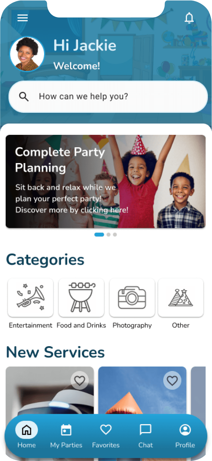
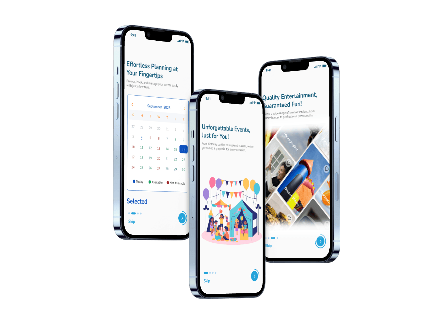
Pasadena Party Patrol (PPP) is an innovative mobile app designed to simplify and enhance the process of booking children's entertainment. The app aims to transform the way parents and businesses coordinate party entertainment, with the goal to increase communication efficiency and delivering a more user-friendly experience. By addressing major pain points such as vendor reliability and real-time updates, the app aims to deliver seamless party planning that users could trust.



Target Audience
Parents planning children's birthday parties are the core target audience for Pasadena Party Patrol. These users required a streamlined, reliable solution for finding and booking entertainment services. They needed a tool that would ensure timely communication with vendors and provide the confidence that their entertainment would show up as planned.
The Challenge
The key challenge was to improve communication between vendors and parents to avoid last-minute surprises, such as no-shows, which were common pain points. Additionally, it was essential for the app to differentiate itself from traditional booking platforms by incorporating easy-to-use features and enhancing user trust through real-time updates and communication tools.

Pain Points
After conducting user interviews and analyzing competitor apps, we identified critical areas to improve:
1.
Vendor Accountability & Communication:
40% of users expressed concern over vendors not arriving at the agreed upon time.
2.
Cashless Experience
65% of surveyed customers expressed a preference for cashless payment methods, citing convenience and security as key reasons.
3.
Detailed Party Descriptions
78% of surveyed customers expressed interest in viewing more detailed and accurate descriptions of party packages before making a booking.

Jackie Perkins
I wish there was a way to keep the vendors accountable so that I know they will be arriving at the time of the party.

Nicole Bryan
I would love to pay in advance. I don’t usually carry cash so it usually is an inconvenience when I have to look for some to pay the vendors.

Jessica Sandoval
I usually start with searching for the activity I want, then I look at the reviews to see if what was described was the same as what past users experienced. If there aren’t good or any reviews, I usually look for a different company.
Pain Points
After conducting user interviews and analyzing competitor apps, we identified critical areas to improve:
1.
Vendor Accountability & Communication:
40% of users expressed concern over vendors not arriving at the agreed upon time.
2.
Cashless Experience
65% of surveyed customers expressed a preference for cashless payment methods, citing convenience and security as key reasons.
3.
Detailed Party Descriptions
78% of surveyed customers expressed interest in viewing more detailed and accurate descriptions of party packages before making a booking.

Jackie Perkins
I wish there was a way to keep the vendors accountable so that I know they will be arriving at the time of the party.

Nicole Bryan
I would love to pay in advance. I don’t usually carry cash so it usually is an inconvenience when I have to look for some to pay the vendors.

Jessica Sandoval
I usually start with searching for the activity I want, then I look at the reviews to see if what was described was the same as what past users experienced. If there aren’t good or any reviews, I usually look for a different company.
Pain Points
After conducting user interviews and analyzing competitor apps, we identified critical areas to improve:
1.
Vendor Accountability & Communication:
40% of users expressed concern over vendors not arriving at the agreed upon time.
2.
Cashless Experience
65% of surveyed customers expressed a preference for cashless payment methods, citing convenience and security as key reasons.
3.
Detailed Party Descriptions
78% of surveyed customers expressed interest in viewing more detailed and accurate descriptions of party packages before making a booking.

Jackie Perkins
I wish there was a way to keep the vendors accountable so that I know they will be arriving at the time of the party.

Nicole Bryan
I would love to pay in advance. I don’t usually carry cash so it usually is an inconvenience when I have to look for some to pay the vendors.

Jessica Sandoval
I usually start with searching for the activity I want, then I look at the reviews to see if what was described was the same as what past users experienced. If there aren’t good or any reviews, I usually look for a different company.
Pain Points
After conducting user interviews and analyzing competitor apps, we identified critical areas to improve:
1.
Vendor Accountability & Communication:
40% of users expressed concern over vendors not arriving at the agreed upon time.
2.
Cashless Experience
65% of surveyed customers expressed a preference for cashless payment methods, citing convenience and security as key reasons.
3.
Detailed Party Descriptions
78% of surveyed customers expressed interest in viewing more detailed and accurate descriptions of party packages before making a booking.

Jackie Perkins
I wish there was a way to keep the vendors accountable so that I know they will be arriving at the time of the party.

Nicole Bryan
I would love to pay in advance. I don’t usually carry cash so it usually is an inconvenience when I have to look for some to pay the vendors.

Jessica Sandoval
I usually start with searching for the activity I want, then I look at the reviews to see if what was described was the same as what past users experienced. If there aren’t good or any reviews, I usually look for a different company.
Pain Points
After conducting user interviews and analyzing competitor apps, we identified critical areas to improve:
1.
Vendor Accountability & Communication:
40% of users expressed concern over vendors not arriving at the agreed upon time.
2.
Cashless Experience
65% of surveyed customers expressed a preference for cashless payment methods, citing convenience and security as key reasons.
3.
Detailed Party Descriptions
78% of surveyed customers expressed interest in viewing more detailed and accurate descriptions of party packages before making a booking.

Jackie Perkins
I wish there was a way to keep the vendors accountable so that I know they will be arriving at the time of the party.

Nicole Bryan
I would love to pay in advance. I don’t usually carry cash so it usually is an inconvenience when I have to look for some to pay the vendors.

Jessica Sandoval
I usually start with searching for the activity I want, then I look at the reviews to see if what was described was the same as what past users experienced. If there aren’t good or any reviews, I usually look for a different company.
Pain Points
After conducting user interviews and analyzing competitor apps, we identified critical areas to improve:
1.
Vendor Accountability & Communication:
40% of users expressed concern over vendors not arriving at the agreed upon time.
2.
Cashless Experience
65% of surveyed customers expressed a preference for cashless payment methods, citing convenience and security as key reasons.
3.
Detailed Party Descriptions
78% of surveyed customers expressed interest in viewing more detailed and accurate descriptions of party packages before making a booking.

Jackie Perkins
I wish there was a way to keep the vendors accountable so that I know they will be arriving at the time of the party.

Nicole Bryan
I would love to pay in advance. I don’t usually carry cash so it usually is an inconvenience when I have to look for some to pay the vendors.

Jessica Sandoval
I usually start with searching for the activity I want, then I look at the reviews to see if what was described was the same as what past users experienced. If there aren’t good or any reviews, I usually look for a different company.
Pain Points
After conducting user interviews and analyzing competitor apps, we identified critical areas to improve:
1.
Vendor Accountability & Communication:
40% of users expressed concern over vendors not arriving at the agreed upon time.
2.
Cashless Experience
65% of surveyed customers expressed a preference for cashless payment methods, citing convenience and security as key reasons.
3.
Detailed Party Descriptions
78% of surveyed customers expressed interest in viewing more detailed and accurate descriptions of party packages before making a booking.

Jackie Perkins
I wish there was a way to keep the vendors accountable so that I know they will be arriving at the time of the party.

Nicole Bryan
I would love to pay in advance. I don’t usually carry cash so it usually is an inconvenience when I have to look for some to pay the vendors.

Jessica Sandoval
I usually start with searching for the activity I want, then I look at the reviews to see if what was described was the same as what past users experienced. If there aren’t good or any reviews, I usually look for a different company.
Problem Solved
Vendor Accountability & Communication:
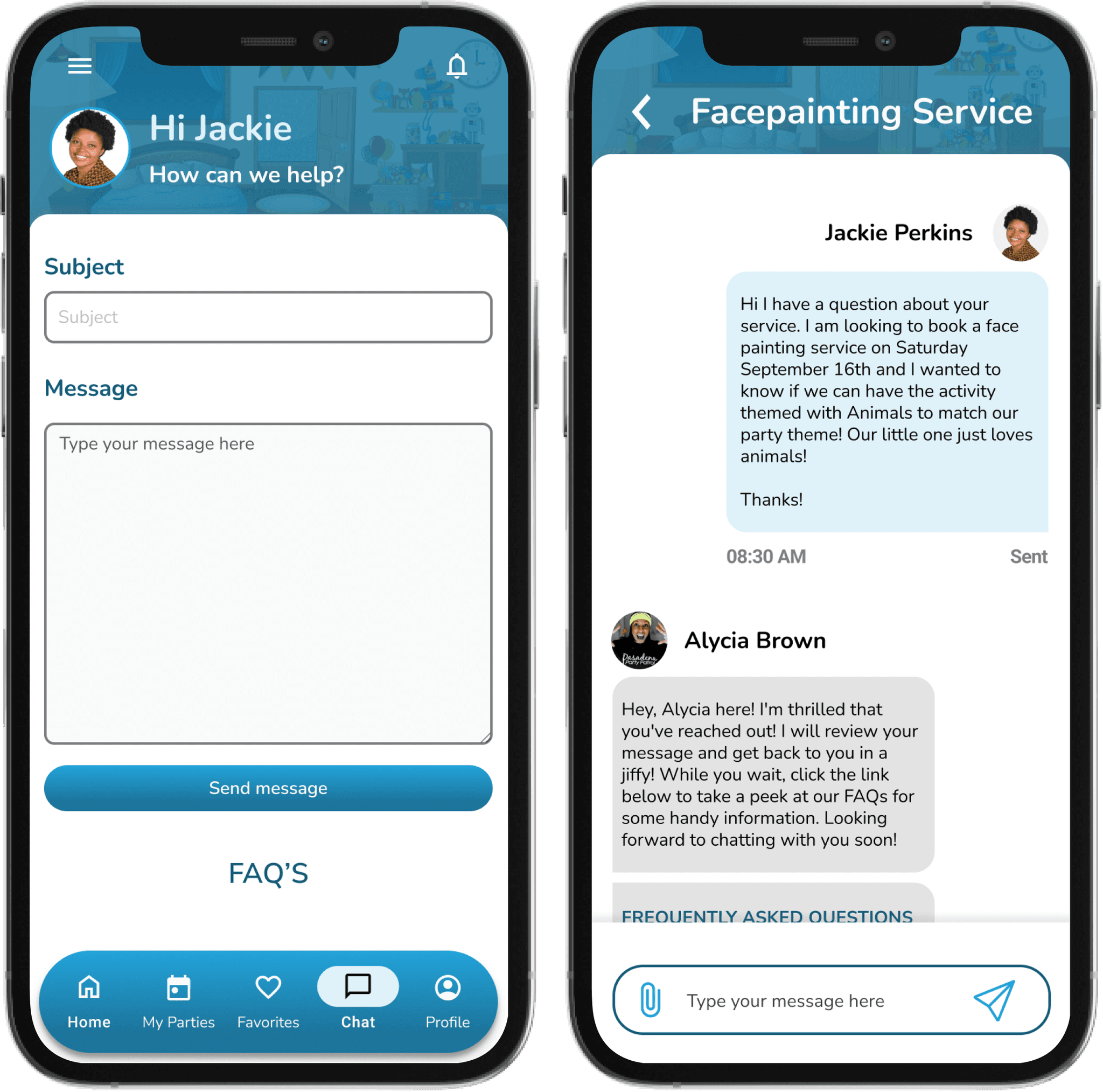
During the discovery phase, I uncovered that one of the most frustrating issues for parents was vendor accountability. To address this, I integrated a real-time chat feature, allowing parents to communicate directly with vendors and receive critical updates.
Problem Solved
Push Notifications:
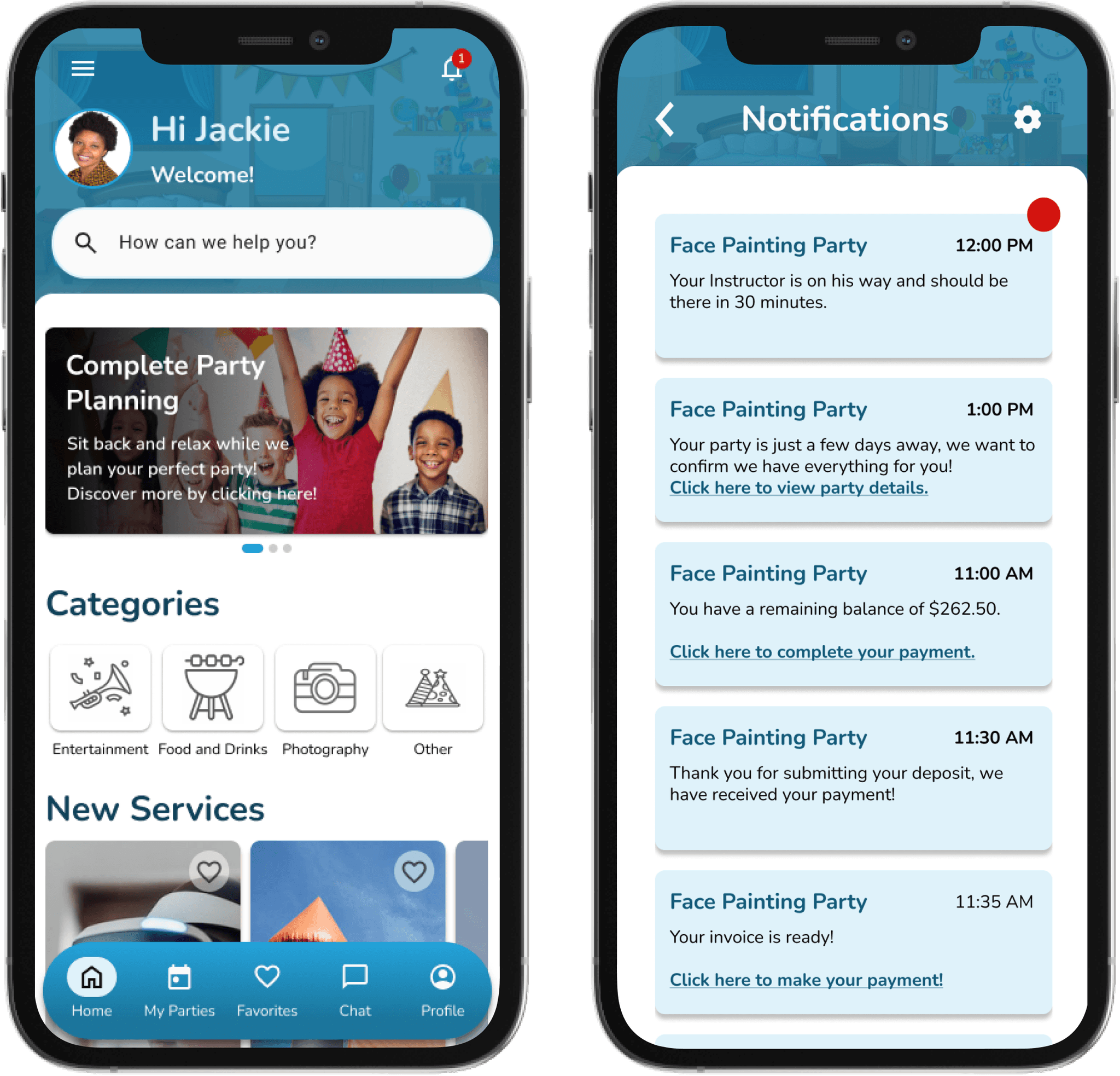
To further improve vendor-client interactions, I introduced push notifications. This system provided timely updates on vendor status.Users were kept informed about vendor locations, time of arrival, and key reminders, ensuring no details were overlooked.
Problem Solved
Push Notifications:
To further improve vendor-client interactions, I introduced push notifications. This system provided timely updates on vendor status.Users were kept informed about vendor locations, time of arrival, and key reminders, ensuring no details were overlooked.

Problem Solved
Push Notifications:
To further improve vendor-client interactions, I introduced push notifications. This system provided timely updates on vendor status.Users were kept informed about vendor locations, time of arrival, and key reminders, ensuring no details were overlooked.

Problem Solved
Push Notifications:
To further improve vendor-client interactions, I introduced push notifications. This system provided timely updates on vendor status.Users were kept informed about vendor locations, time of arrival, and key reminders, ensuring no details were overlooked.

Problem Solved
Push Notifications:
To further improve vendor-client interactions, I introduced push notifications. This system provided timely updates on vendor status.Users were kept informed about vendor locations, time of arrival, and key reminders, ensuring no details were overlooked.

Problem Solved
Push Notifications:
To further improve vendor-client interactions, I introduced push notifications. This system provided timely updates on vendor status.Users were kept informed about vendor locations, time of arrival, and key reminders, ensuring no details were overlooked.

Problem Solved
Booking and In-App Purchases:
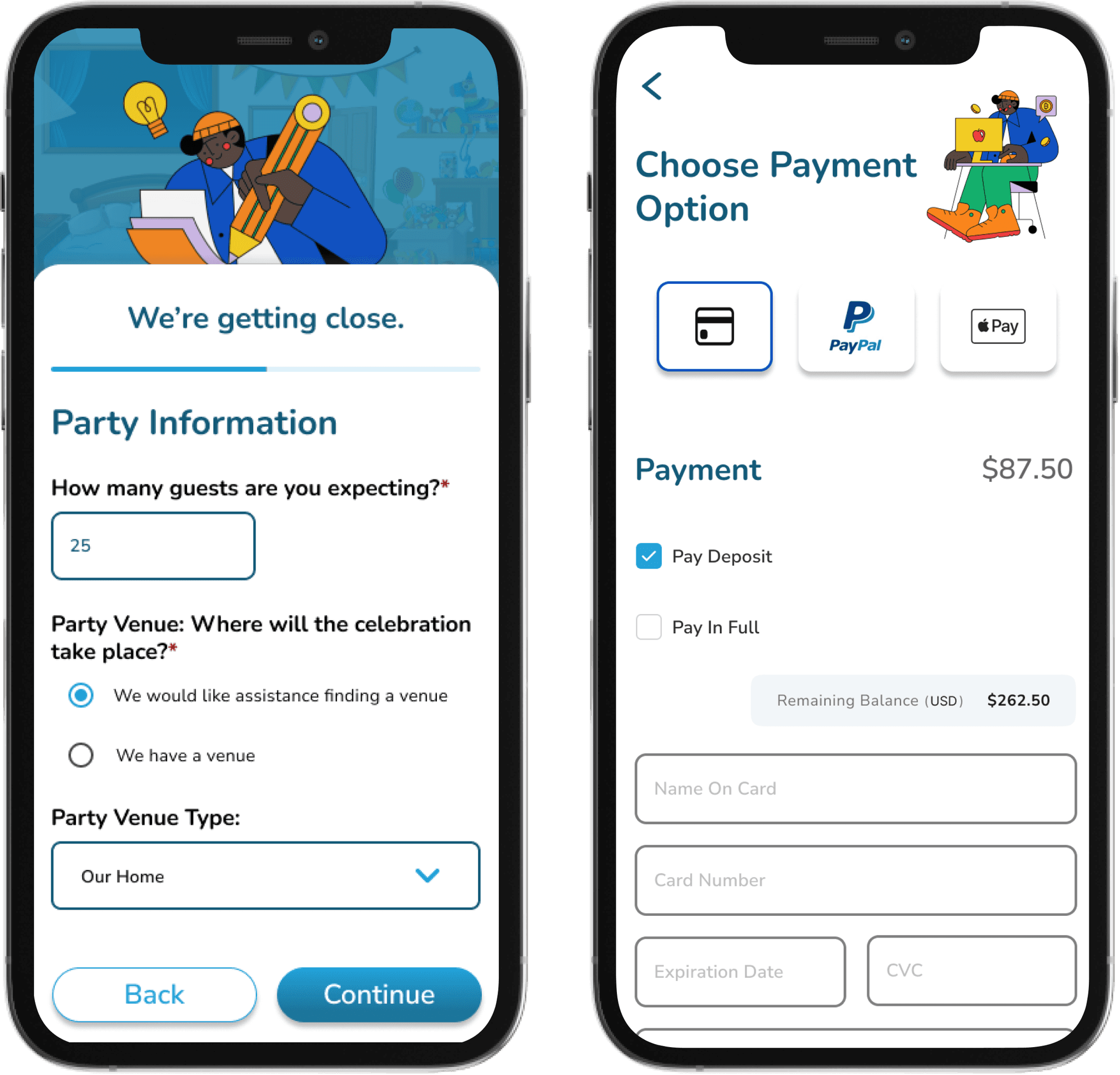
Through user interviews, it became clear that simplifying the booking process was paramount. I added the ability to search, book, and pay for services directly in the app.

Problem Solved
Booking and In-App Purchases:
Through user interviews, it became clear that simplifying the booking process was paramount. I added the ability to search, book, and pay for services directly in the app.

Problem Solved
Booking and In-App Purchases:
Through user interviews, it became clear that simplifying the booking process was paramount. I added the ability to search, book, and pay for services directly in the app.

Problem Solved
Booking and In-App Purchases:
Through user interviews, it became clear that simplifying the booking process was paramount. I added the ability to search, book, and pay for services directly in the app.

Problem Solved
Booking and In-App Purchases:
Through user interviews, it became clear that simplifying the booking process was paramount. I added the ability to search, book, and pay for services directly in the app.

Problem Solved
Booking and In-App Purchases:
Through user interviews, it became clear that simplifying the booking process was paramount. I added the ability to search, book, and pay for services directly in the app.

Problem Solved
Booking and In-App Purchases:
Through user interviews, it became clear that simplifying the booking process was paramount. I added the ability to search, book, and pay for services directly in the app.
Problem Solved
Detailed Vendor Descriptions:
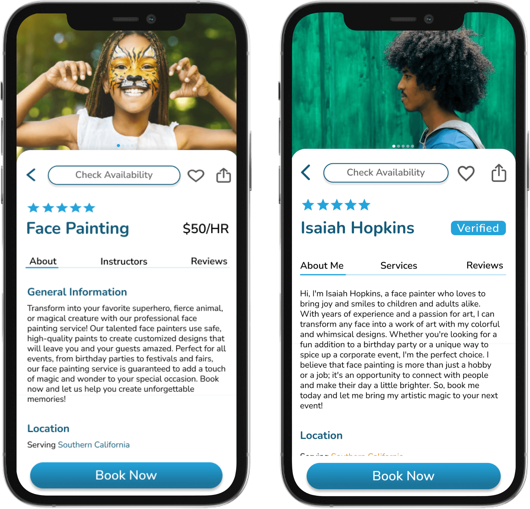
Detailed information right at the tip of the users fingers. They are able to learn all about each service including FAQ’s, scheduling and what they need to prepare ahead of time. In additional, a closer look at the instructor provides safety and comfort in knowing who will be there at the party.

Design Process
In order to discover how to solve the problem most of her users face when dealing with booking entertainment, I went through an extensive design process.
Understand
User Research
User Interview
Competitve Analysis
Define
User Personas
Empathy Map
User Journey
Ideate
User Flow
Information Architecture
Design
Wireframe
Hi-Fi Designs
Prototype
Test
Feedbacks
Conclusion
Future Concept
Read more about my design process
Design Process
In order to discover how to solve the problem most of her users face when dealing with booking entertainment, I went through an extensive design process.
Design
Wireframe
Hi-Fi Designs
Prototype
Test
Feedbacks
Conclusion
Future Concept
Read more about my design process
Understand
User Research
User Interview
Competitve Analysis
Define
User Personas
Empathy Map
User Journey
Ideate
User Flow
Information Architecture
My Role
At Pasadena Party Patrol, I served as the lead UX/UI designer responsible for creating a seamless mobile app experience.
My key responsibilities included developing the app’s user interface, ensuring intuitive navigation, and implementing key features such as in-app messaging, push notifications, and a streamlined booking process.
I also conducted user research, usability testing, and iterative design improvements to enhance communication between parents and vendors, ultimately aiming to improve bookings and overall satisfaction to encourage repeat customers.
Additionally, I provided strategic guidance on branding and user experience throughout the project.


Usability Testing
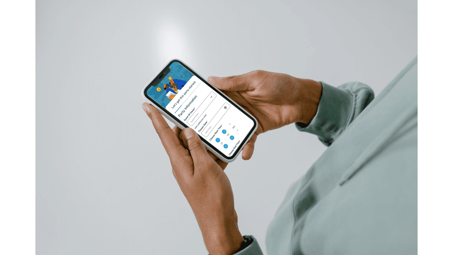
Throughout my process I put my designs through intensive usability testing to ensure that the designs were user friendly and solved my user goals.
Usability Testing
Throughout my process I put my designs through intensive usability testing to ensure that the designs were user friendly and solved my user goals.

Usability Testing
Throughout my process I put my designs through intensive usability testing to ensure that the designs were user friendly and solved my user goals.

Usability Testing
Throughout my process I put my designs through intensive usability testing to ensure that the designs were user friendly and solved my user goals.

Usability Testing
Throughout my process I put my designs through intensive usability testing to ensure that the designs were user friendly and solved my user goals.

Usability Testing
Throughout my process I put my designs through intensive usability testing to ensure that the designs were user friendly and solved my user goals.

Usability Testing
Throughout my process I put my designs through intensive usability testing to ensure that the designs were user friendly and solved my user goals.

Iterating on Creating an Account
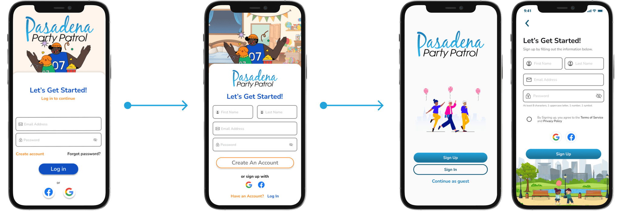
Placing "Create Account" as a secondary option caused usability challenges, with 80% of testers struggling to register. This led to 64% abandonment rate.
Prioritizing the "Create an Account" button boosted user satisfaction by 60% and addressed retention issues, increasing new registrations by 45% and decreasing account abandonment by 30% during usability testing.
The branding was updated to match the company's identity and target audience.
User sign-up was simplified for a smoother onboarding.
New features allow logging in, signing up, or exploring as a guest, enhancing flexibility and accessibility.
Iterating on Creating an Account

Placing "Create Account" as a secondary option caused usability challenges, with 80% of testers struggling to register. This led to 64% abandonment rate.
Prioritizing the "Create an Account" button boosted user satisfaction by 60% and addressed retention issues, increasing new registrations by 45% and decreasing account abandonment by 30% during usability testing.
The branding was updated to match the company's identity and target audience.
User sign-up was simplified for a smoother onboarding.
New features allow logging in, signing up, or exploring as a guest, enhancing flexibility and accessibility.
Iterating on Creating an Account

Placing "Create Account" as a secondary option caused usability challenges, with 80% of testers struggling to register. This led to 64% abandonment rate.
Prioritizing the "Create an Account" button boosted user satisfaction by 60% and addressed retention issues, increasing new registrations by 45% and decreasing account abandonment by 30% during usability testing.
The branding was updated to match the company's identity and target audience.
User sign-up was simplified for a smoother onboarding.
New features allow logging in, signing up, or exploring as a guest, enhancing flexibility and accessibility.
Iterating on Creating an Account

Placing "Create Account" as a secondary option caused usability challenges, with 80% of testers struggling to register. This led to 64% abandonment rate.
Prioritizing the "Create an Account" button boosted user satisfaction by 60% and addressed retention issues, increasing new registrations by 45% and decreasing account abandonment by 30% during usability testing.
The branding was updated to match the company's identity and target audience.
User sign-up was simplified for a smoother onboarding.
New features allow logging in, signing up, or exploring as a guest, enhancing flexibility and accessibility.
Iterating on Creating an Account

Placing "Create Account" as a secondary option caused usability challenges, with 80% of testers struggling to register. This led to 64% abandonment rate.
Prioritizing the "Create an Account" button boosted user satisfaction by 60% and addressed retention issues, increasing new registrations by 45% and decreasing account abandonment by 30% during usability testing.
The branding was updated to match the company's identity and target audience.
User sign-up was simplified for a smoother onboarding.
New features allow logging in, signing up, or exploring as a guest, enhancing flexibility and accessibility.
Iterating on Creating an Account

Placing "Create Account" as a secondary option caused usability challenges, with 80% of testers struggling to register. This led to 64% abandonment rate.
Prioritizing the "Create an Account" button boosted user satisfaction by 60% and addressed retention issues, increasing new registrations by 45% and decreasing account abandonment by 30% during usability testing.
The branding was updated to match the company's identity and target audience.
User sign-up was simplified for a smoother onboarding.
New features allow logging in, signing up, or exploring as a guest, enhancing flexibility and accessibility.
Iterating on Creating an Account

Placing "Create Account" as a secondary option caused usability challenges, with 80% of testers struggling to register. This led to 64% abandonment rate.
Prioritizing the "Create an Account" button boosted user satisfaction by 60% and addressed retention issues, increasing new registrations by 45% and decreasing account abandonment by 30% during usability testing.
The branding was updated to match the company's identity and target audience.
User sign-up was simplified for a smoother onboarding.
New features allow logging in, signing up, or exploring as a guest, enhancing flexibility and accessibility.
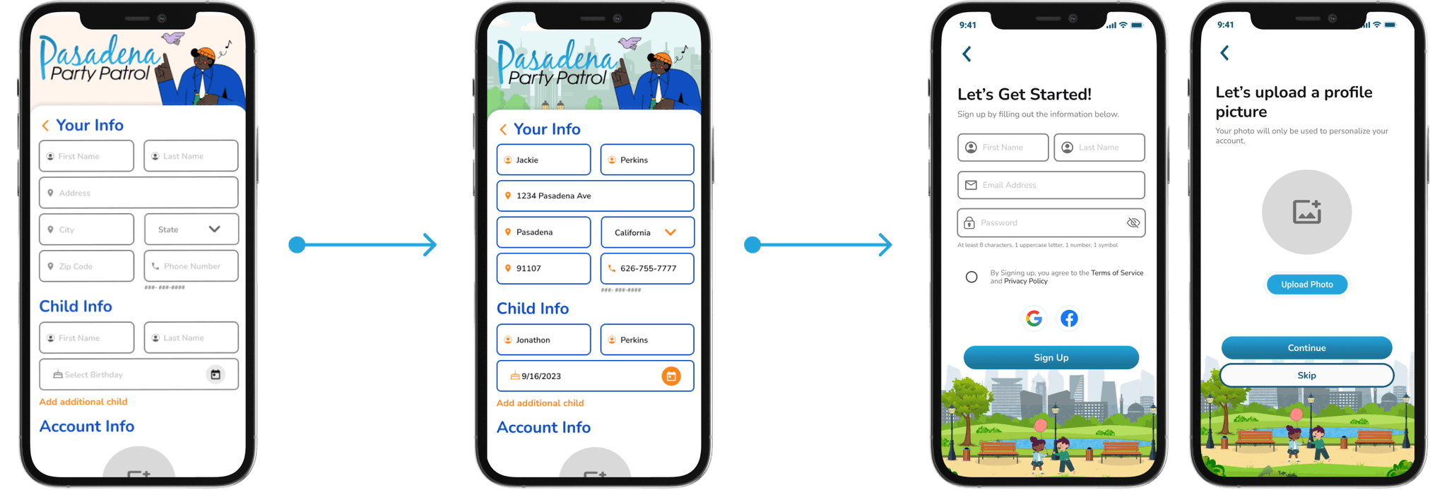
Iterating on Onboarding Questions
Originally, had a complex onboarding process requiring child information and a profile photo.
During the second round, updated to make it more visually appealing for users.
We eliminated unnecessary upfront questions related to child security, simplifying the initial user experience. Parents now have the option to provide their child’s information only when they are ready to book a party, streamlining the process while maintaining privacy and enhancing convenience.

Iterating on Navbar and Home page
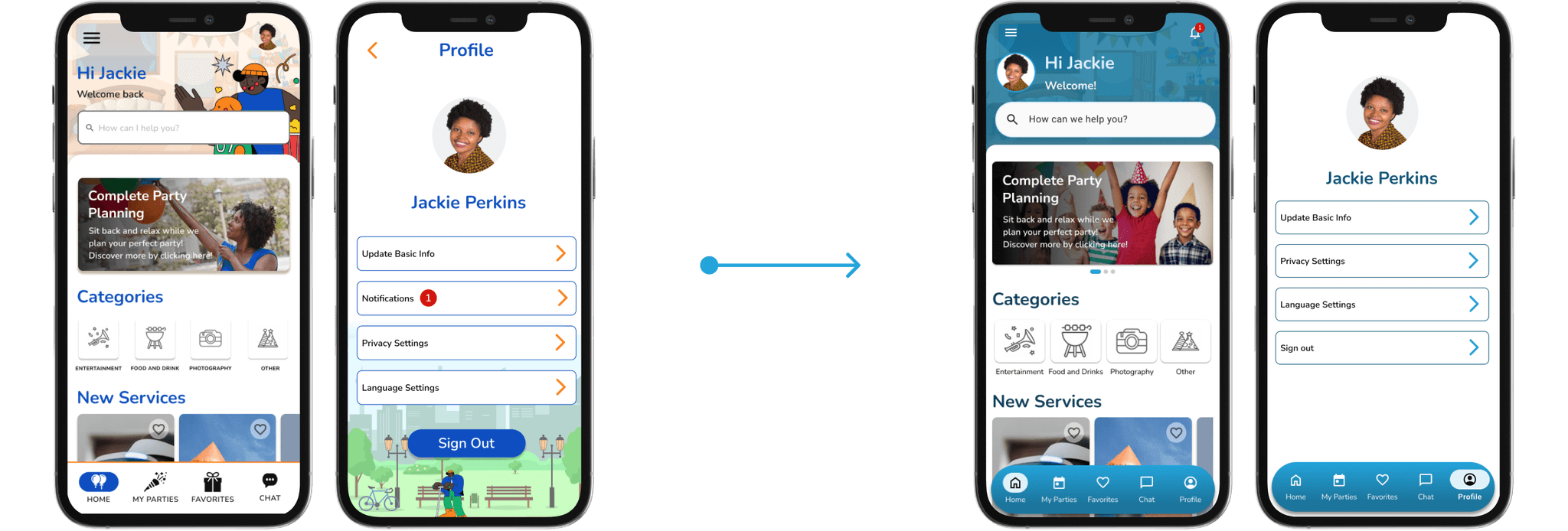
Initially, I focused on creating a clean and intuitive navigation bar, incorporating playful illustrations to deliver an engaging and enjoyable experience for users. The profile section was strategically positioned in the top-right corner, allowing users to easily access a drop-down menu for settings, notifications, and other account options, ensuring seamless navigation while maintaining a fun, user-friendly interface.
The homepage was redesigned for a more personalized experience, greeting users by name and profile image. Notifications are now easily accessible for quick updates, while profile information is featured in the navigation bar for seamless access to settings and account details.
Iterating on Navbar and Home page

Initially, I focused on creating a clean and intuitive navigation bar, incorporating playful illustrations to deliver an engaging and enjoyable experience for users. The profile section was strategically positioned in the top-right corner, allowing users to easily access a drop-down menu for settings, notifications, and other account options, ensuring seamless navigation while maintaining a fun, user-friendly interface.
The homepage was redesigned for a more personalized experience, greeting users by name and profile image. Notifications are now easily accessible for quick updates, while profile information is featured in the navigation bar for seamless access to settings and account details.
Iterating on Navbar and Home page

Initially, I focused on creating a clean and intuitive navigation bar, incorporating playful illustrations to deliver an engaging and enjoyable experience for users. The profile section was strategically positioned in the top-right corner, allowing users to easily access a drop-down menu for settings, notifications, and other account options, ensuring seamless navigation while maintaining a fun, user-friendly interface.
The homepage was redesigned for a more personalized experience, greeting users by name and profile image. Notifications are now easily accessible for quick updates, while profile information is featured in the navigation bar for seamless access to settings and account details.
Iterating on Navbar and Home page

Initially, I focused on creating a clean and intuitive navigation bar, incorporating playful illustrations to deliver an engaging and enjoyable experience for users. The profile section was strategically positioned in the top-right corner, allowing users to easily access a drop-down menu for settings, notifications, and other account options, ensuring seamless navigation while maintaining a fun, user-friendly interface.
The homepage was redesigned for a more personalized experience, greeting users by name and profile image. Notifications are now easily accessible for quick updates, while profile information is featured in the navigation bar for seamless access to settings and account details.
Iterating on Navbar and Home page

Initially, I focused on creating a clean and intuitive navigation bar, incorporating playful illustrations to deliver an engaging and enjoyable experience for users. The profile section was strategically positioned in the top-right corner, allowing users to easily access a drop-down menu for settings, notifications, and other account options, ensuring seamless navigation while maintaining a fun, user-friendly interface.
The homepage was redesigned for a more personalized experience, greeting users by name and profile image. Notifications are now easily accessible for quick updates, while profile information is featured in the navigation bar for seamless access to settings and account details.
Iterating on Navbar and Home page

Initially, I focused on creating a clean and intuitive navigation bar, incorporating playful illustrations to deliver an engaging and enjoyable experience for users. The profile section was strategically positioned in the top-right corner, allowing users to easily access a drop-down menu for settings, notifications, and other account options, ensuring seamless navigation while maintaining a fun, user-friendly interface.
The homepage was redesigned for a more personalized experience, greeting users by name and profile image. Notifications are now easily accessible for quick updates, while profile information is featured in the navigation bar for seamless access to settings and account details.
Iterating on Navbar and Home page

Initially, I focused on creating a clean and intuitive navigation bar, incorporating playful illustrations to deliver an engaging and enjoyable experience for users. The profile section was strategically positioned in the top-right corner, allowing users to easily access a drop-down menu for settings, notifications, and other account options, ensuring seamless navigation while maintaining a fun, user-friendly interface.
The homepage was redesigned for a more personalized experience, greeting users by name and profile image. Notifications are now easily accessible for quick updates, while profile information is featured in the navigation bar for seamless access to settings and account details.
High Fidelity Screen
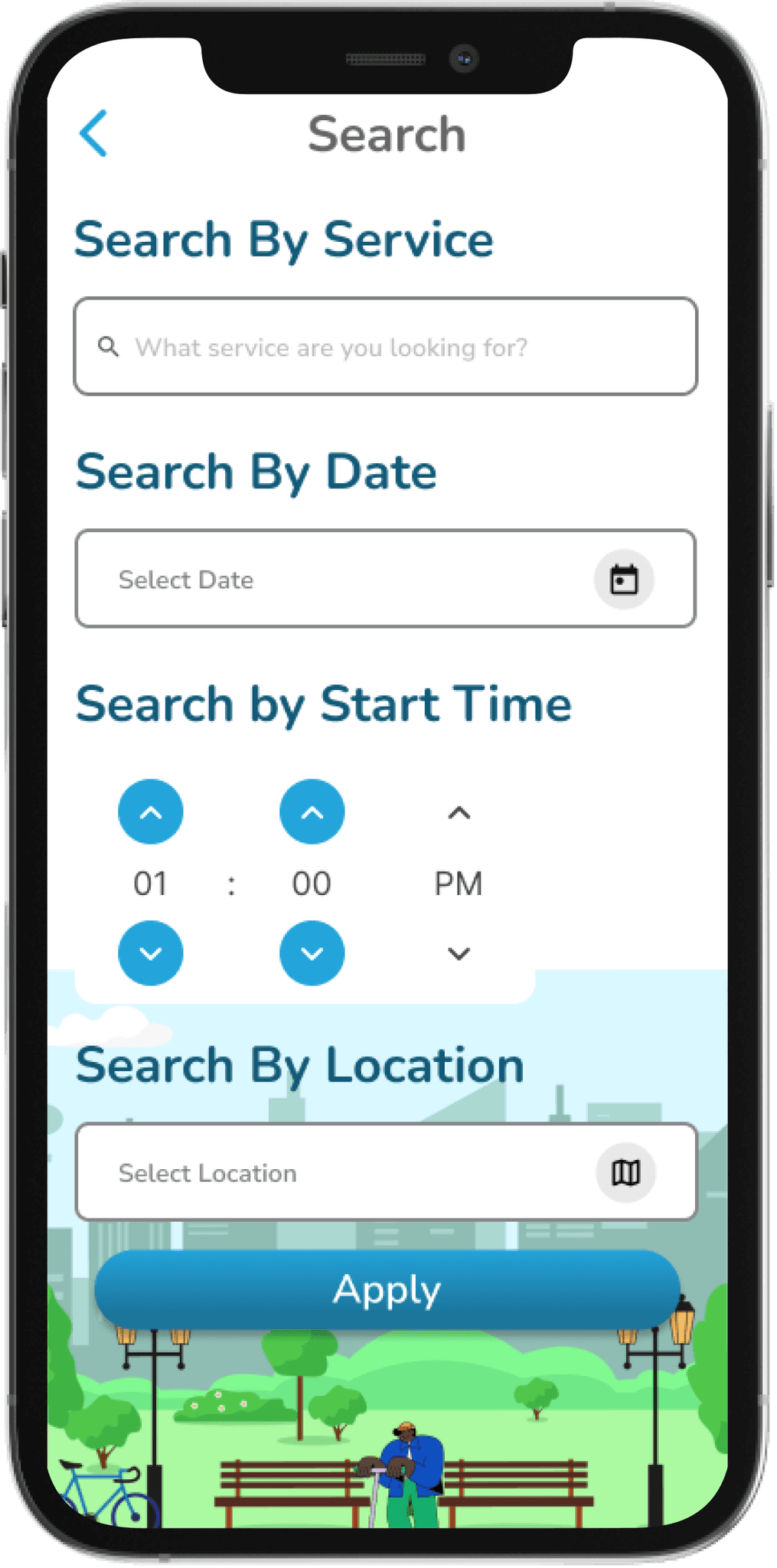
Search
The advanced search feature streamlines the booking process, allowing users to quickly find and select the specific services they need, enhancing efficiency.
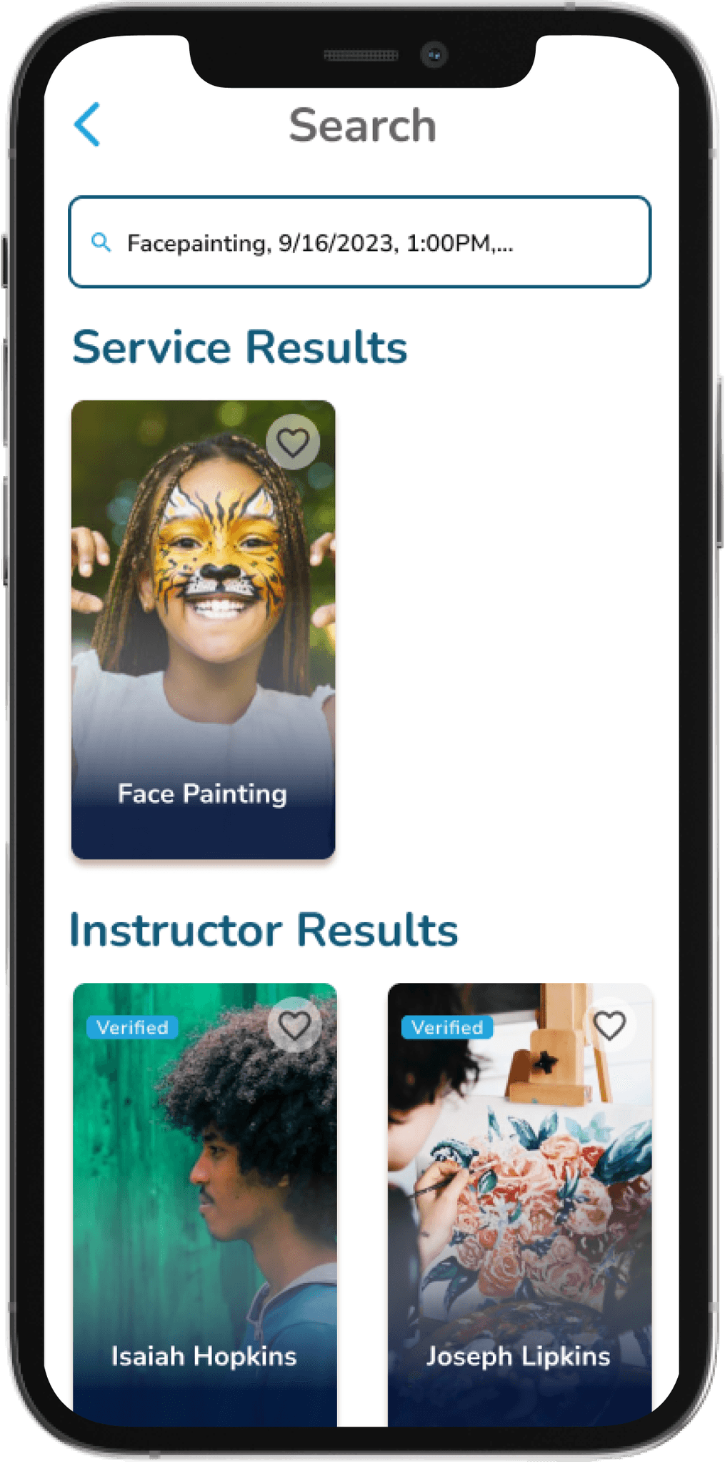
Search Results
The ability to view detailed profiles of instructors who provide each service offers users valuable insights into who will be leading their event. This transparency helps build trust and allows users to make more informed decisions, ensuring a more personalized and confident booking experience.
High Fidelity Screen

Search
The advanced search feature streamlines the booking process, allowing users to quickly find and select the specific services they need, enhancing efficiency.

Search Results
The ability to view detailed profiles of instructors who provide each service offers users valuable insights into who will be leading their event. This transparency helps build trust and allows users to make more informed decisions, ensuring a more personalized and confident booking experience.
High Fidelity Screen

Search
The advanced search feature streamlines the booking process, allowing users to quickly find and select the specific services they need, enhancing efficiency.

Search Results
The ability to view detailed profiles of instructors who provide each service offers users valuable insights into who will be leading their event. This transparency helps build trust and allows users to make more informed decisions, ensuring a more personalized and confident booking experience.
High Fidelity Screen

Search
The advanced search feature streamlines the booking process, allowing users to quickly find and select the specific services they need, enhancing efficiency.

Search Results
The ability to view detailed profiles of instructors who provide each service offers users valuable insights into who will be leading their event. This transparency helps build trust and allows users to make more informed decisions, ensuring a more personalized and confident booking experience.
High Fidelity Screen

Search
The advanced search feature streamlines the booking process, allowing users to quickly find and select the specific services they need, enhancing efficiency.

Search Results
The ability to view detailed profiles of instructors who provide each service offers users valuable insights into who will be leading their event. This transparency helps build trust and allows users to make more informed decisions, ensuring a more personalized and confident booking experience.
High Fidelity Screen

Search
The advanced search feature streamlines the booking process, allowing users to quickly find and select the specific services they need, enhancing efficiency.

Search Results
The ability to view detailed profiles of instructors who provide each service offers users valuable insights into who will be leading their event. This transparency helps build trust and allows users to make more informed decisions, ensuring a more personalized and confident booking experience.
High Fidelity Screen

Search
The advanced search feature streamlines the booking process, allowing users to quickly find and select the specific services they need, enhancing efficiency.

Search Results
The ability to view detailed profiles of instructors who provide each service offers users valuable insights into who will be leading their event. This transparency helps build trust and allows users to make more informed decisions, ensuring a more personalized and confident booking experience.
High Fidelity Screen
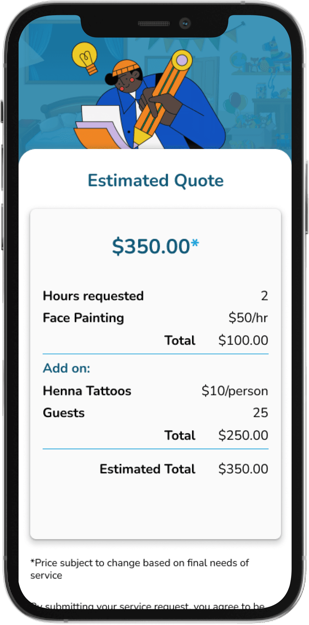
Estimated Quote
The in-app quote feature allows users to easily view and manage pricing details, enabling them to plan and budget for their party with confidence. This streamlined access to quotes ensures transparency and helps users make informed decisions, enhancing the overall party planning experience.
High Fidelity Screen

Estimated Quote
The in-app quote feature allows users to easily view and manage pricing details, enabling them to plan and budget for their party with confidence. This streamlined access to quotes ensures transparency and helps users make informed decisions, enhancing the overall party planning experience.
High Fidelity Screen

Estimated Quote
The in-app quote feature allows users to easily view and manage pricing details, enabling them to plan and budget for their party with confidence. This streamlined access to quotes ensures transparency and helps users make informed decisions, enhancing the overall party planning experience.
High Fidelity Screen

Estimated Quote
The in-app quote feature allows users to easily view and manage pricing details, enabling them to plan and budget for their party with confidence. This streamlined access to quotes ensures transparency and helps users make informed decisions, enhancing the overall party planning experience.
High Fidelity Screen

Estimated Quote
The in-app quote feature allows users to easily view and manage pricing details, enabling them to plan and budget for their party with confidence. This streamlined access to quotes ensures transparency and helps users make informed decisions, enhancing the overall party planning experience.
High Fidelity Screen

Estimated Quote
The in-app quote feature allows users to easily view and manage pricing details, enabling them to plan and budget for their party with confidence. This streamlined access to quotes ensures transparency and helps users make informed decisions, enhancing the overall party planning experience.
High Fidelity Screen

Estimated Quote
The in-app quote feature allows users to easily view and manage pricing details, enabling them to plan and budget for their party with confidence. This streamlined access to quotes ensures transparency and helps users make informed decisions, enhancing the overall party planning experience.
High Fidelity Screen
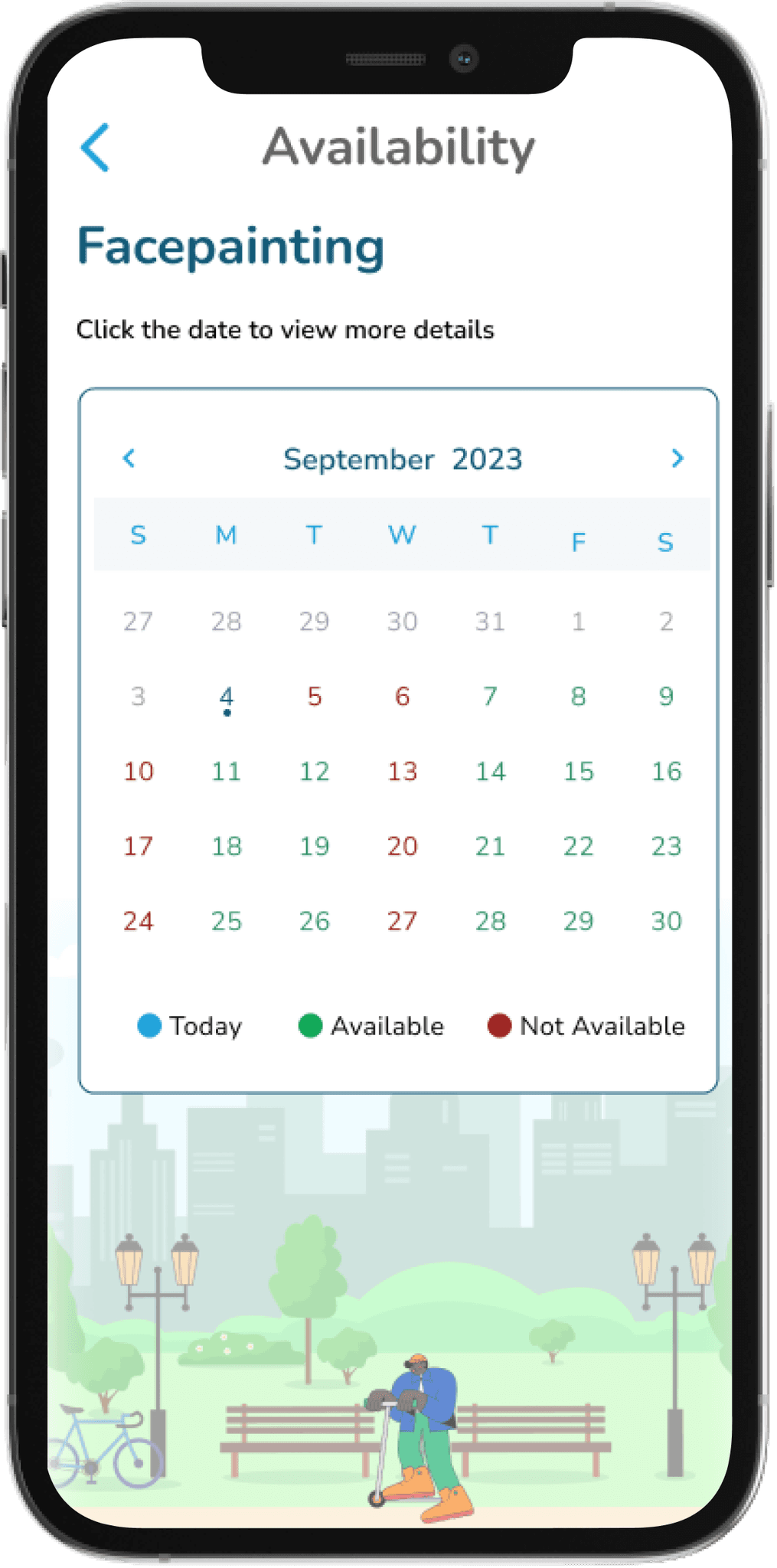
Availability
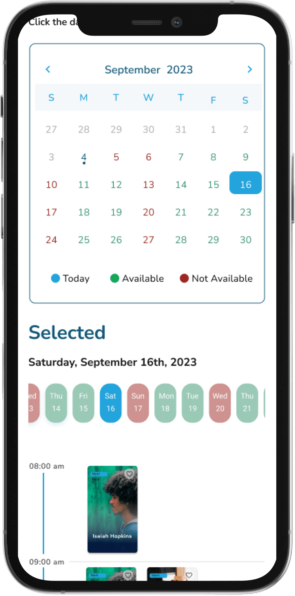
Vendor Availability
The app provides real-time vendor availability, allowing users to instantly check which instructors are available for their event. This feature simplifies scheduling by aligning party times with instructor availability, ensuring a smooth booking process and eliminating the need for back-and-forth coordination.
High Fidelity Screen

Availability

Vendor Availability
The app provides real-time vendor availability, allowing users to instantly check which instructors are available for their event. This feature simplifies scheduling by aligning party times with instructor availability, ensuring a smooth booking process and eliminating the need for back-and-forth coordination.
High Fidelity Screen

Availability

Vendor Availability
The app provides real-time vendor availability, allowing users to instantly check which instructors are available for their event. This feature simplifies scheduling by aligning party times with instructor availability, ensuring a smooth booking process and eliminating the need for back-and-forth coordination.
High Fidelity Screen

Availability

Vendor Availability
The app provides real-time vendor availability, allowing users to instantly check which instructors are available for their event. This feature simplifies scheduling by aligning party times with instructor availability, ensuring a smooth booking process and eliminating the need for back-and-forth coordination.
High Fidelity Screen

Availability

Vendor Availability
The app provides real-time vendor availability, allowing users to instantly check which instructors are available for their event. This feature simplifies scheduling by aligning party times with instructor availability, ensuring a smooth booking process and eliminating the need for back-and-forth coordination.
High Fidelity Screen

Availability

Vendor Availability
The app provides real-time vendor availability, allowing users to instantly check which instructors are available for their event. This feature simplifies scheduling by aligning party times with instructor availability, ensuring a smooth booking process and eliminating the need for back-and-forth coordination.
High Fidelity Screen

Availability

Vendor Availability
The app provides real-time vendor availability, allowing users to instantly check which instructors are available for their event. This feature simplifies scheduling by aligning party times with instructor availability, ensuring a smooth booking process and eliminating the need for back-and-forth coordination.
Key Takeaways
Working on Pasadena Party Patrol taught me the importance of balancing user needs with business goals. I learned how vital clear communication is in enhancing user experience, especially when integrating complex features like in-app messaging and real-time notifications. The project improved my ability to conduct thorough user research and usability testing, which helped me refine the app’s design for better engagement and ease of use. Additionally, I gained experience in simplifying complex processes, such as booking and vendor management, which strengthened my problem-solving and UX/UI skills. This project also deepened my understanding of the importance of accessibility and user-centered design, pushing me to focus on intuitive navigation and responsive features. Overall, it enhanced my ability to deliver thoughtful, impactful design solutions that drive user satisfaction and business success.
Roadmap
The future roadmap for Pasadena Party Patrol involves upgrading the entire app’s branding to better align with the evolving identity of the business. This includes refreshing the visual elements, color schemes, and overall user interface to create a more cohesive and engaging experience. In addition to the branding overhaul, there is a potential shift from a mobile app to a full-featured website, as the stakeholder’s business goals have changed. This shift aims to offer greater accessibility and scalability, catering to a broader audience while providing enhanced functionality.The project had been temporarily paused in June 2023 due to changing priorities, but it is now being resumed, August 2024, with a renewed focus on building a web-based platform. This transition reflects the stakeholder's vision to expand the business and create a more flexible solution for users, allowing for a seamless booking experience across devices. The upgraded branding and potential website development will help position Pasadena Party Patrol for future growth and success.
Thank you for viewing
if you like my case study and would like to learn more let’s connect!
krystian54rutledge@gmail.com
Next Case Study: Clinton Corners Entertainment
Thank you for viewing
if you like my case study and would like to learn more let’s connect!
krystian54rutledge@gmail.com
Next Case Study: Clinton Corners Entertainment
Thank you for viewing
if you like my case study and would like to learn more let’s connect!
krystian54rutledge@gmail.com
Next Case Study: Clinton Corners Entertainment
Thank you for viewing
if you like my case study and would like to learn more let’s connect!
krystian54rutledge@gmail.com
Next Case Study: Clinton Corners Entertainment
Thank you for viewing
if you like my case study and would like to learn more let’s connect!
krystian54rutledge@gmail.com
Next Case Study: Clinton Corners Entertainment
Thank you for viewing
if you like my case study and would like to learn more let’s connect!
krystian54rutledge@gmail.com
Next Case Study: Clinton Corners Entertainment